ACTUELLEMENT
↳ Mari & père aimant
↳ Co—Fondateur @opium—lab®
↳ Conception d’un écosystème d’hospitalité
↳ Bretagne 2027 (On en parle bientôt)
↳ Occasionnellement, jury @Graphis
↳ @Adobe Beta Program
↳ Mentorat
Faisons connaissance...
Pour moi, une histoire, un objet, une marque. Tout commence par un gribouillage en bas de page. Une idée fragile qui cherche à faire sa place. Puis vient le travail : lui donner une forme si juste qu’elle finit par sembler évidente. Je crois que l’émotion commence là où les mots s’arrêtent. L’évidence dans ce que l’on ressent avant même de savoir pourquoi. L’évidence dans ce que l’on reconnaît sans même avoir besoin de l’expliquer. L’évidence dans ce qui reste, longtemps après avoir tout oublié du reste. C’est probablement pour cela que je fais ce métier.
PROJETS SÉLECTIONNÉS
Matter
_
BIENTÔT
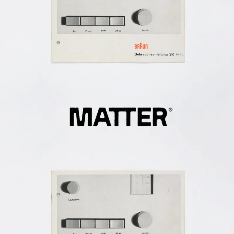
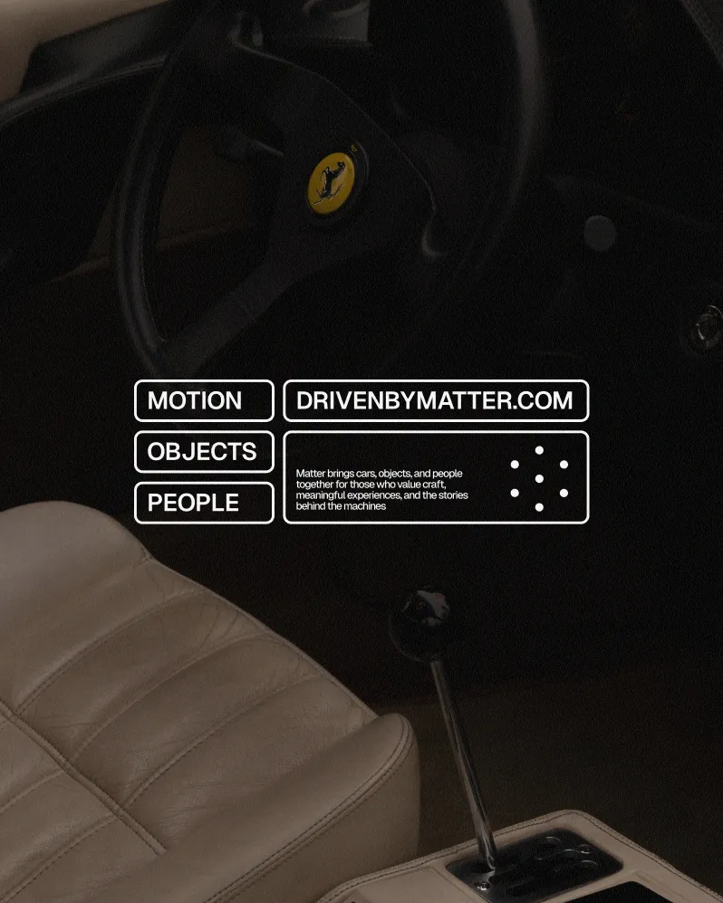
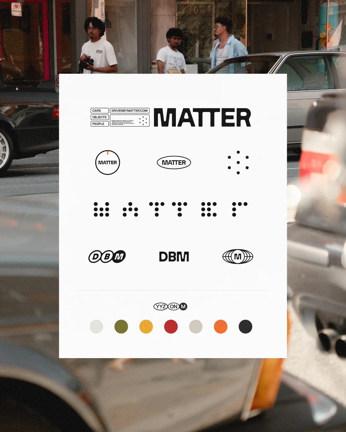
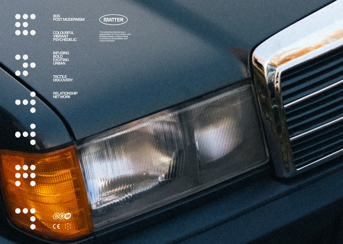
Matter is a passion project quietly taking shape with a group of friends brought together by cars, design, and shared history. I’m shaping the brand strategy, identity, and digital presence, in close collaboration with the people behind it. It’s an exploration of objects, people, and machines that carry meaning over time. More to come.
VOIR PLUS
SERVICES
IDENTITÉ, MOTION

DBM_01.mp4
DBM_02.MP4
DBM_03.JPG
DBM_04.JPG
DBM_05.JPG
DBM_06.JPG
Matter
,
IDENTITÉ, MOTION
,
BIENTÔT
DÉTAILS DU PROJET
Matter is a passion project quietly taking shape with a group of friends brought together by cars, design, and shared history. I’m shaping the brand strategy, identity, and digital presence, in close collaboration with the people behind it. It’s an exploration of objects, people, and machines that carry meaning over time. More to come.
DBM_01.mp4
DBM_02.MP4
DBM_03.JPG
DBM_04.JPG
DBM_05.JPG
DBM_06.JPG
Eastend
_
2024–2025
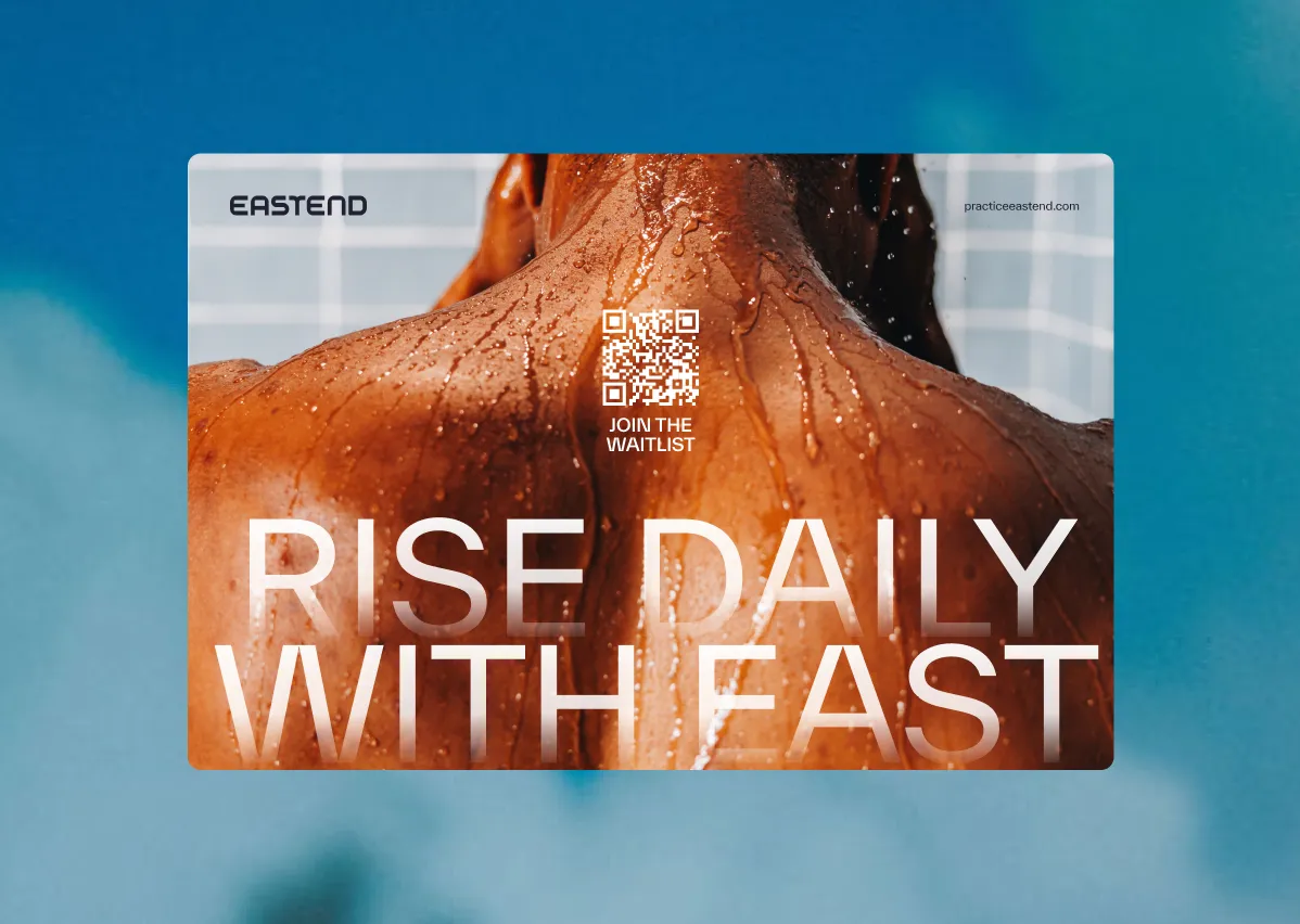
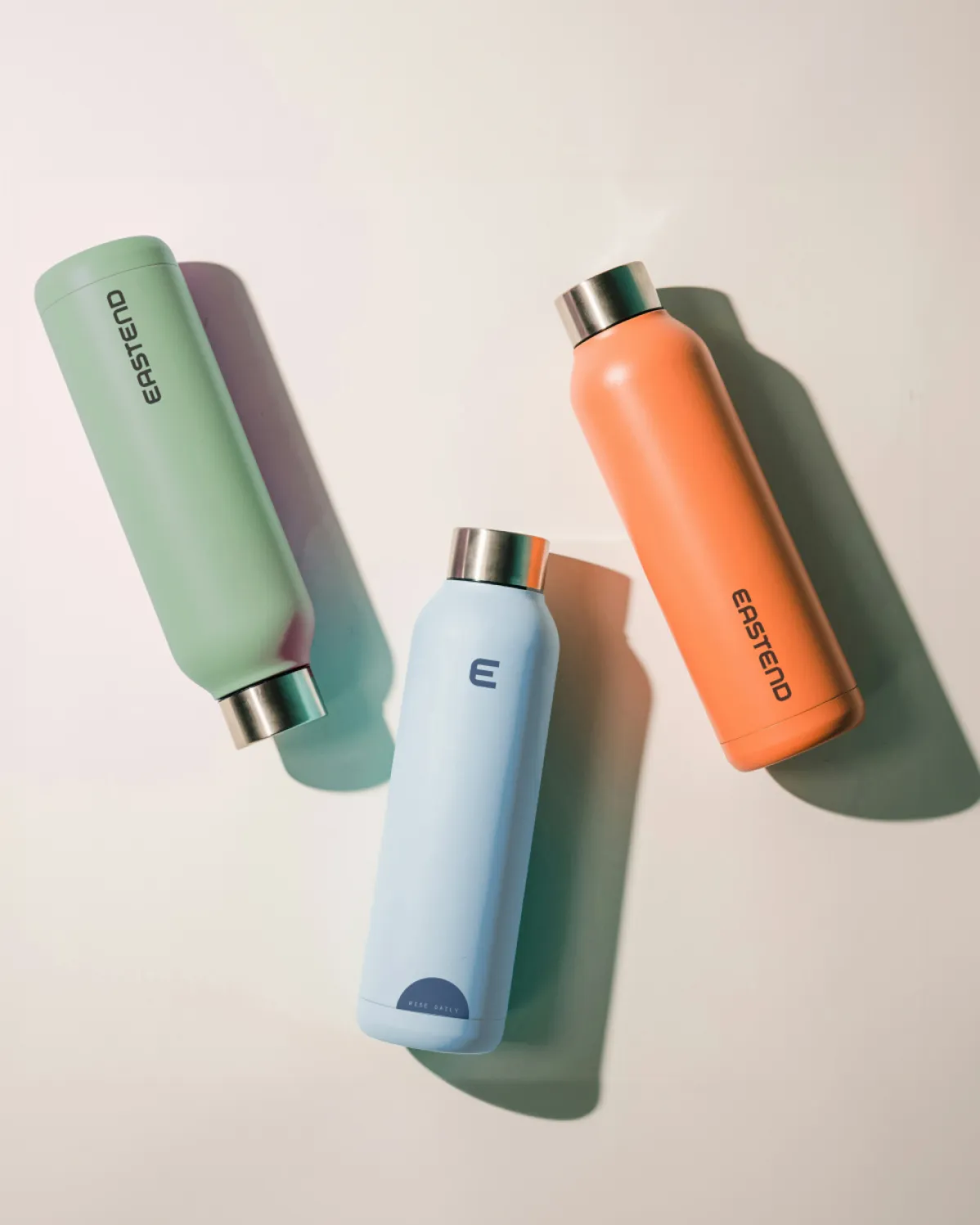
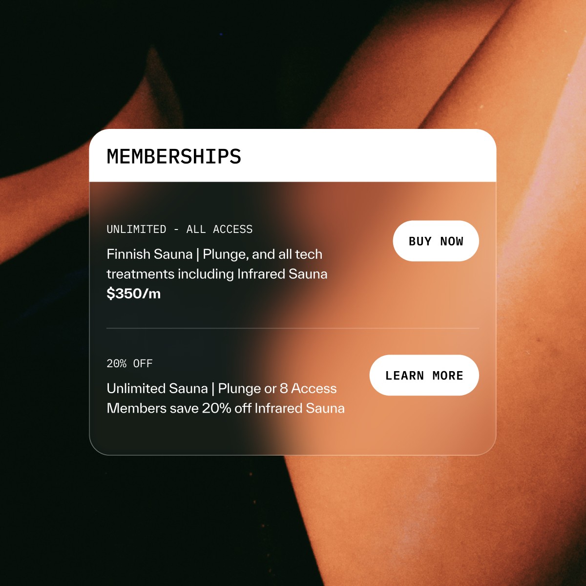
Eastend is a modern wellness space built around the idea of daily practice. I led the brand strategy, identity, and digital experience, helping define how Eastend shows up visually and verbally. The work focused on balancing science and ritual, clarity and warmth, creating a system that feels credible, calm, and human. From positioning and language to identity and website direction, the brand was shaped to support consistency, trust, and long-term growth.
VOIR PLUS
SERVICES
IDENTITÉ, SITE WEB
COLLABORATEURS
Photography: Jonathan Zuluaga
Eastend
,
IDENTITÉ, SITE WEB
,
2024–2025
DÉTAILS DU PROJET
Eastend is a modern wellness space built around the idea of daily practice. I led the brand strategy, identity, and digital experience, helping define how Eastend shows up visually and verbally. The work focused on balancing science and ritual, clarity and warmth, creating a system that feels credible, calm, and human. From positioning and language to identity and website direction, the brand was shaped to support consistency, trust, and long-term growth.
ASP Consulting
_
2024
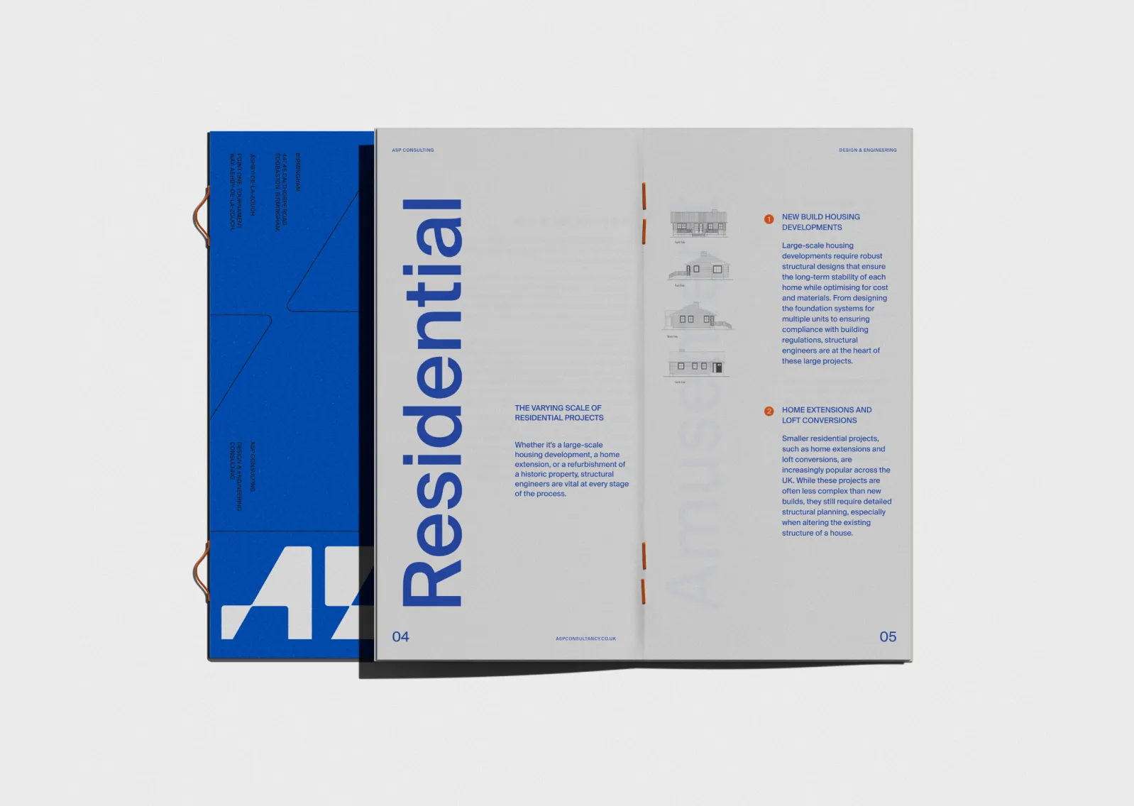
I partnered with ASP during a leadership transition to evolve the brand into a clearer, more confident expression of the firm today and where it’s headed next. The goal was to position ASP as a confident leader, attracting both new clients and fresh energy internally. I designed an identity grounded in structure and motion, pairing a bold visual language with a disciplined system built for everyday use. Grids, templates, and an evolved color system were developed to support internal documentation while maintaining clarity and consistency across external communications.
VOIR PLUS
SERVICES
IDENTITÉ, MOTION
COLLABORATEURS
Animation: Anshika Sharma
ASP_01.,p4
ASP_02.mp4
ASP_03.JPG
ASP_04.JPG
ASP_05.MP4
ASP_06.MP4
ASP Consulting
,
IDENTITÉ, MOTION
,
2024
DÉTAILS DU PROJET
I partnered with ASP during a leadership transition to evolve the brand into a clearer, more confident expression of the firm today and where it’s headed next. The goal was to position ASP as a confident leader, attracting both new clients and fresh energy internally. I designed an identity grounded in structure and motion, pairing a bold visual language with a disciplined system built for everyday use. Grids, templates, and an evolved color system were developed to support internal documentation while maintaining clarity and consistency across external communications.
ASP_01.,p4
ASP_02.mp4
ASP_03.JPG
ASP_04.JPG
ASP_05.MP4
ASP_06.MP4
Pondejoy
_
2022
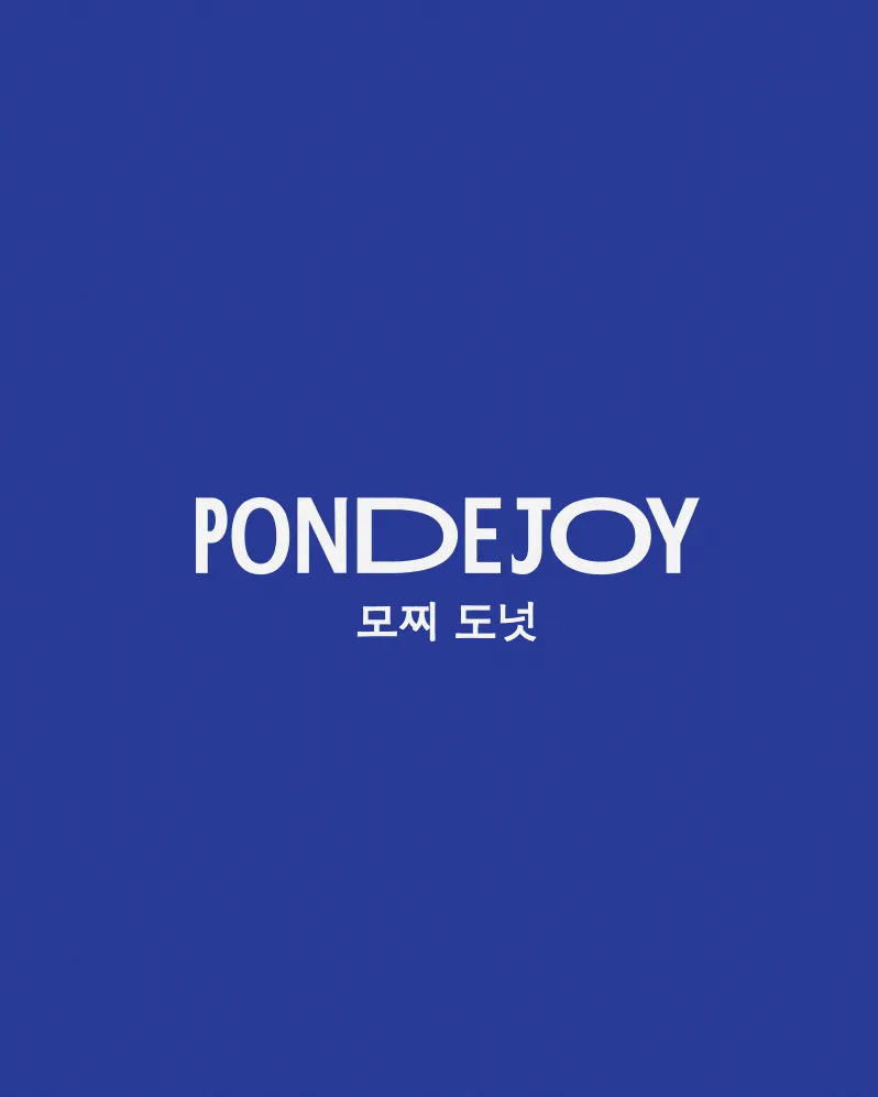
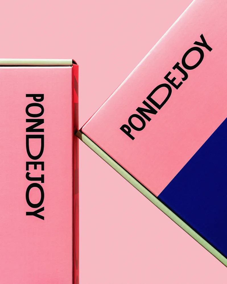
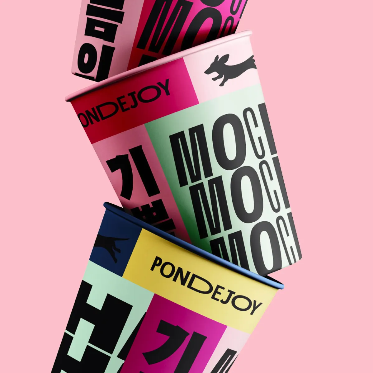
Pondejoy started as a very different idea, a safe, stereotypical brand direction built around what the founder assumed Western audiences wanted. Through deep conversation with Heather Kim, we uncovered a much stronger truth: her entrepreneurial grit, her relationship to family, her love of music, and the resilience behind her story. That insight reshaped everything. We renamed the brand and built an identity rooted in tradition, infused with modern Western cultural energy, and crafted as a design system that could turn packaging into an object you’d want to keep. The work earned a Silver at The Dieline and led to a First Round stage talk, sharing the process behind the presentation.
VOIR PLUS
SERVICES
STRATÉGIE DE MARQUE, NAMING, IDENTITÉ, PACKAGING
COLLABORATEURS
Photography: Pophaus
PDJ_01.JPG
PDJ_02.MP4
PDJ_03.JPG
PDJ_04.MP4
PDJ_05.JPG
PDJ_06.MP4
Pondejoy
,
STRATÉGIE DE MARQUE, NAMING, IDENTITÉ, PACKAGING
,
2022
DÉTAILS DU PROJET
Pondejoy started as a very different idea, a safe, stereotypical brand direction built around what the founder assumed Western audiences wanted. Through deep conversation with Heather Kim, we uncovered a much stronger truth: her entrepreneurial grit, her relationship to family, her love of music, and the resilience behind her story. That insight reshaped everything. We renamed the brand and built an identity rooted in tradition, infused with modern Western cultural energy, and crafted as a design system that could turn packaging into an object you’d want to keep. The work earned a Silver at The Dieline and led to a First Round stage talk, sharing the process behind the presentation.
PDJ_01.JPG
PDJ_02.MP4
PDJ_03.JPG
PDJ_04.MP4
PDJ_05.JPG
PDJ_06.MP4
Canada Post: Diwali Stamp
_
2024
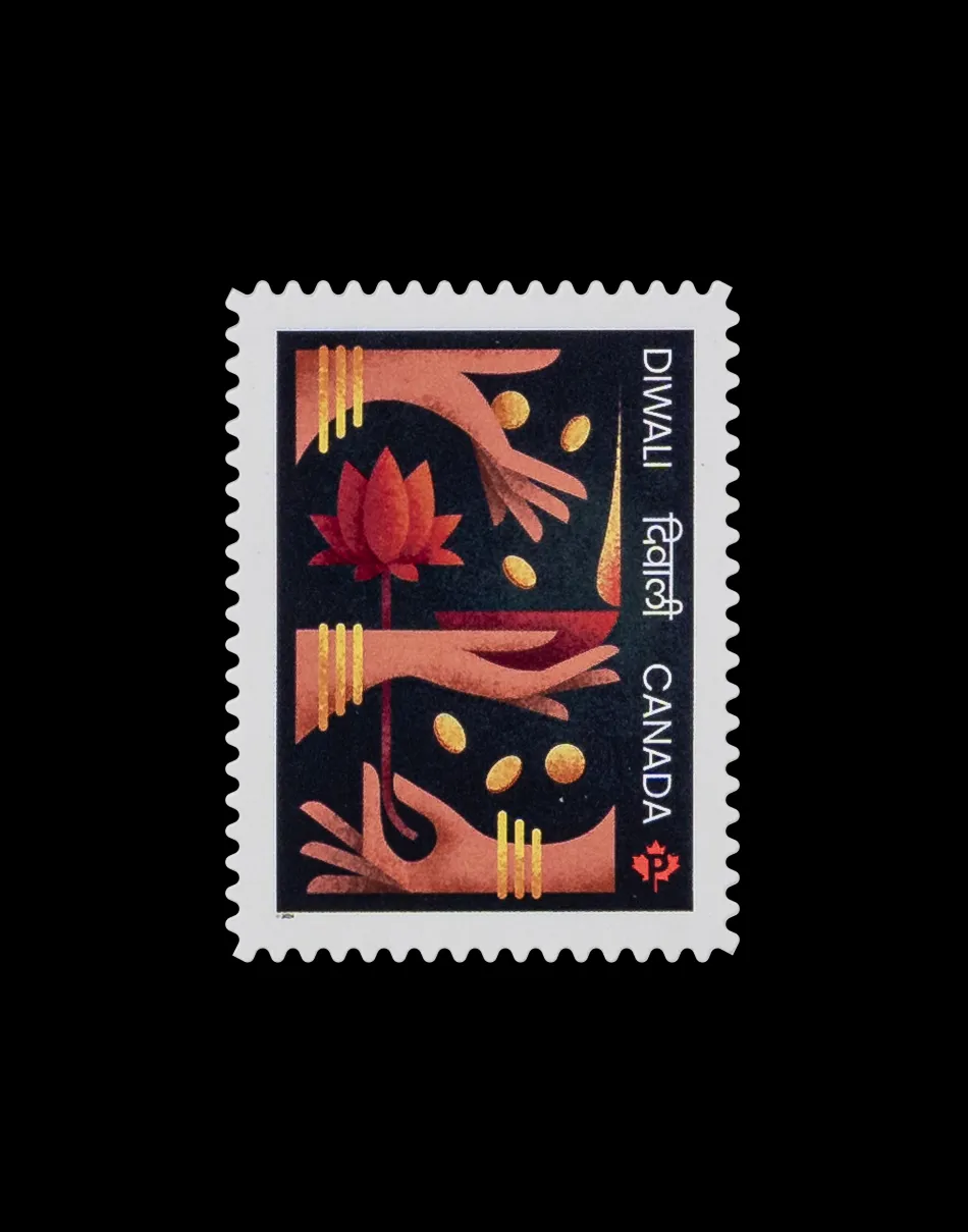
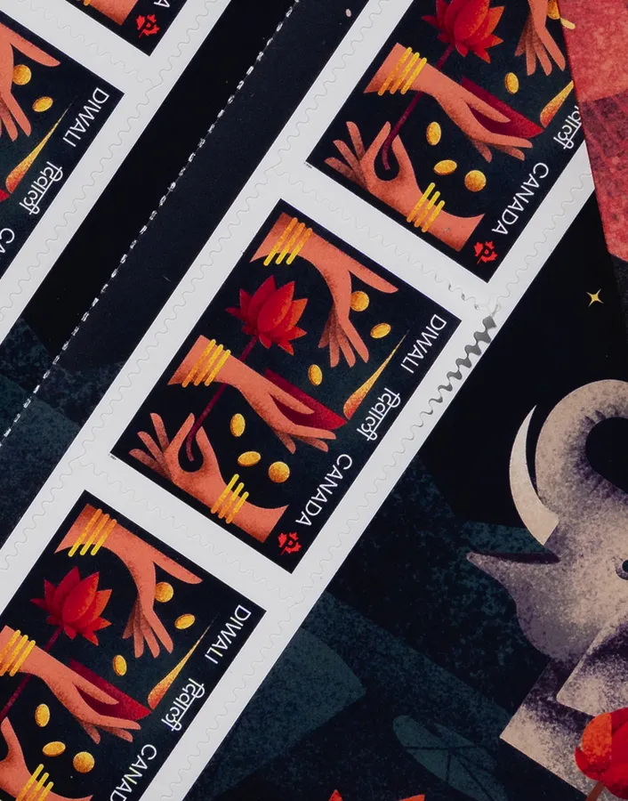
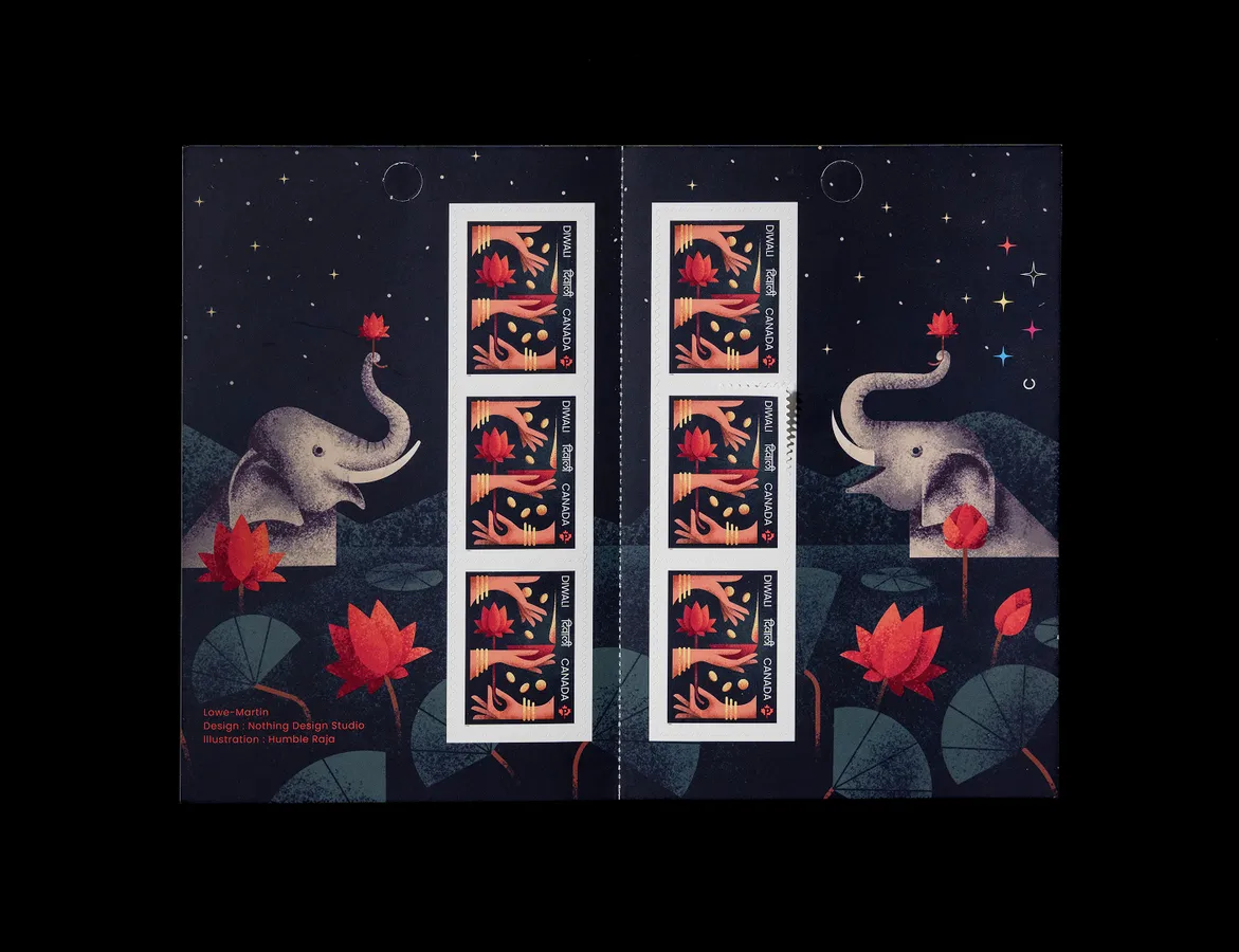
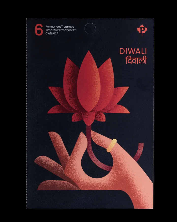
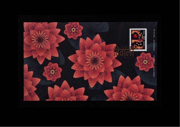
Creating a stamp for Canada Post’s Diwali 2024 issue marked a meaningful milestone for me personally and for the studio. Being able to design something so small, yet capable of traveling into people’s homes and carrying light and joy, was an absolute honour. I led the creative direction and concept, focusing on Lakshmi and the third day of Diwali, centered on prosperity, gratitude, and light. The design draws from Lakshmi’s iconic mudras and symbolic gestures, and was brought to life in collaboration with Reena Mistry of Humble Raja, who absoultey nailed the illustration.
VOIR PLUS
SERVICES
DIRECTION CRÉATIVE, DESIGN DU TIMBRE
COLLABORATEURS
Illustration: Reena Mistry
CP_01.jpg
CP_02.jpg
CP_03.jpg
CP_04.jpg
CP_05.jpg

CP_06.jpg
Canada Post: Diwali Stamp
,
DIRECTION CRÉATIVE, DESIGN DU TIMBRE
,
2024
DÉTAILS DU PROJET
Creating a stamp for Canada Post’s Diwali 2024 issue marked a meaningful milestone for me personally and for the studio. Being able to design something so small, yet capable of traveling into people’s homes and carrying light and joy, was an absolute honour. I led the creative direction and concept, focusing on Lakshmi and the third day of Diwali, centered on prosperity, gratitude, and light. The design draws from Lakshmi’s iconic mudras and symbolic gestures, and was brought to life in collaboration with Reena Mistry of Humble Raja, who absoultey nailed the illustration.
CP_01.jpg
CP_02.jpg
CP_03.jpg
CP_04.jpg
CP_05.jpg
CP_06.jpg
Litheum
_
2024
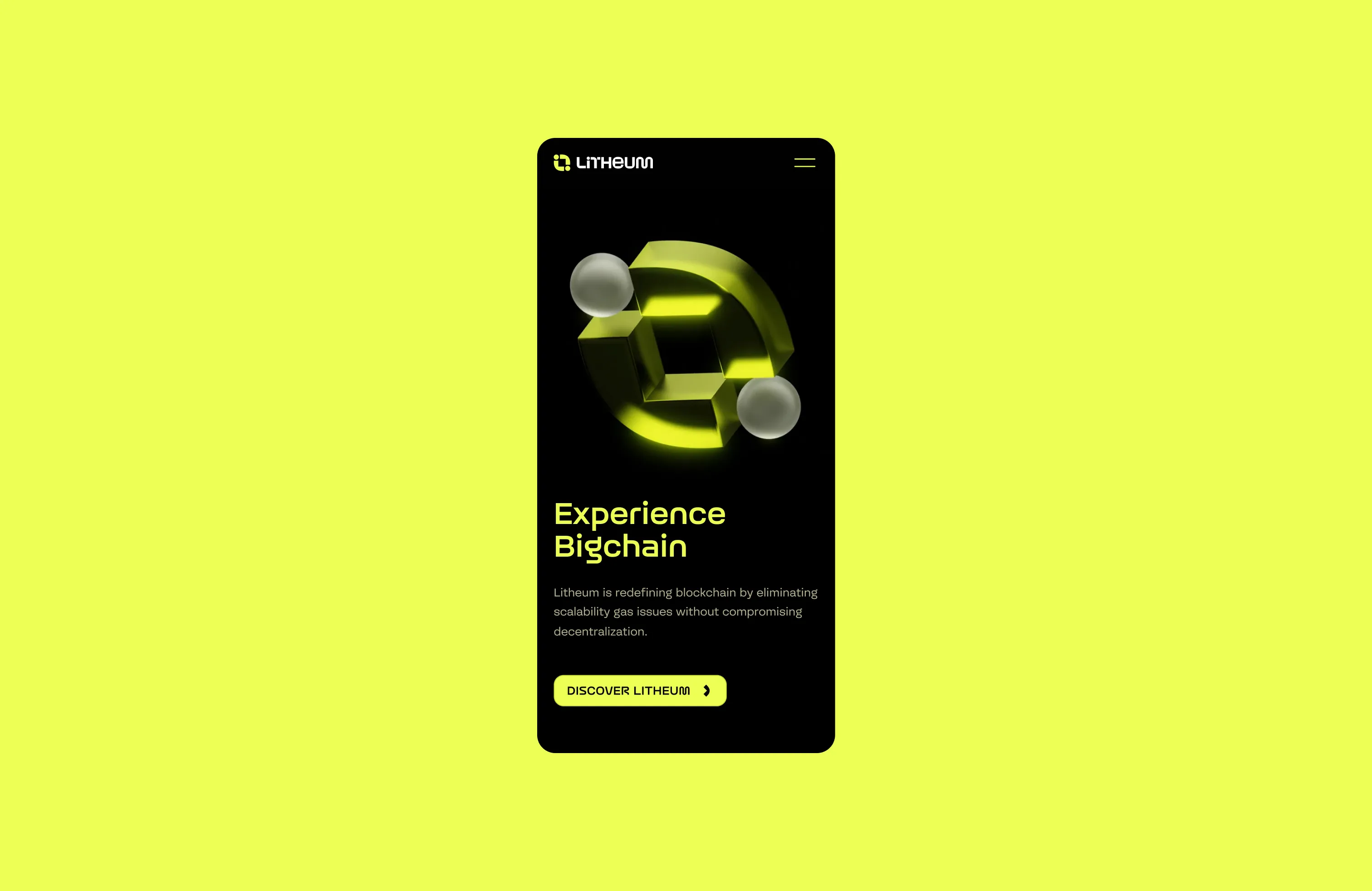
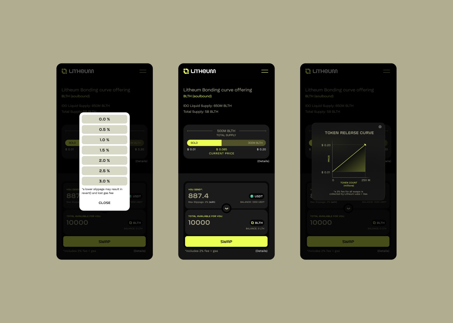
MEAT Studio brought me in as a strategic partner to help extend their identity into a cohesive digital experience. Working closely with their team and the founders, I translated the identity into a functional, scalable website, refining how the brand shows up through layout, interaction, motion language, and a stronger typographic system. Beyond visual execution, the work required deconstructing and reorganizing complex content to establish clear information architecture and navigation. I led the site refresh end-to-end, shaping direction while remaining hands-on in design and development, ensuring the final experience was not only visually aligned, but clear, usable, and built to make sense.
VOIR PLUS
SERVICES
STRATÉGIE WEB, DESIGN & DÉVELOPPEMENT
COLLABORATEURS
Designer: Anshika Sharma Developer: Hanzala
LTH_01.JPG
LTH_02.MP4
LTH_03.MP4
LTH_04.MP4
LTH_05.JPG
LTH_06.MP4
Litheum
,
STRATÉGIE WEB, DESIGN & DÉVELOPPEMENT
,
2024
DÉTAILS DU PROJET
MEAT Studio brought me in as a strategic partner to help extend their identity into a cohesive digital experience. Working closely with their team and the founders, I translated the identity into a functional, scalable website, refining how the brand shows up through layout, interaction, motion language, and a stronger typographic system. Beyond visual execution, the work required deconstructing and reorganizing complex content to establish clear information architecture and navigation. I led the site refresh end-to-end, shaping direction while remaining hands-on in design and development, ensuring the final experience was not only visually aligned, but clear, usable, and built to make sense.
LTH_01.JPG
LTH_02.MP4
LTH_03.MP4
LTH_04.MP4
LTH_05.JPG
LTH_06.MP4
Spline Group
_
2020
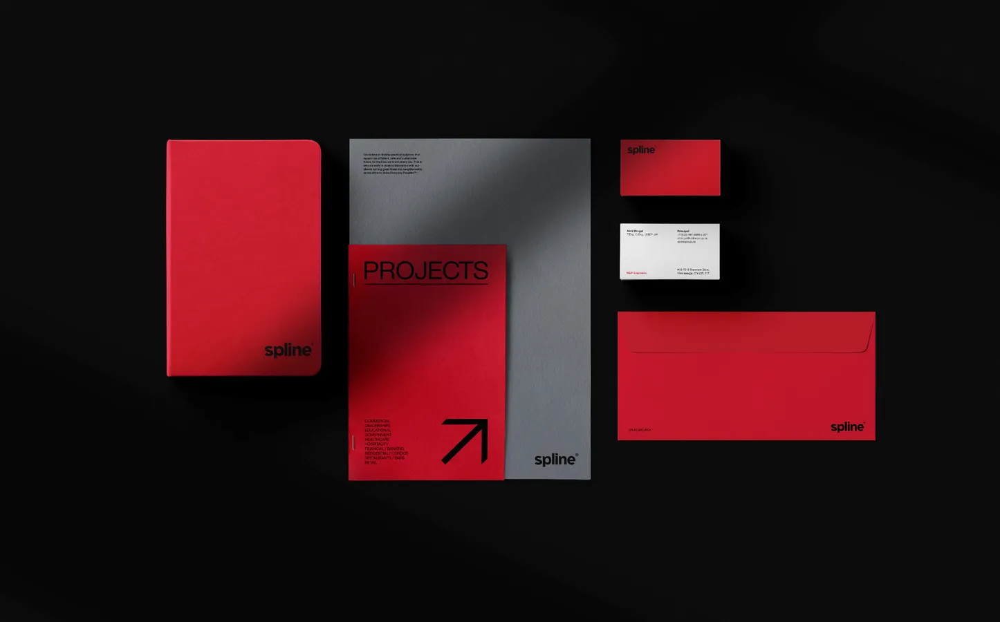
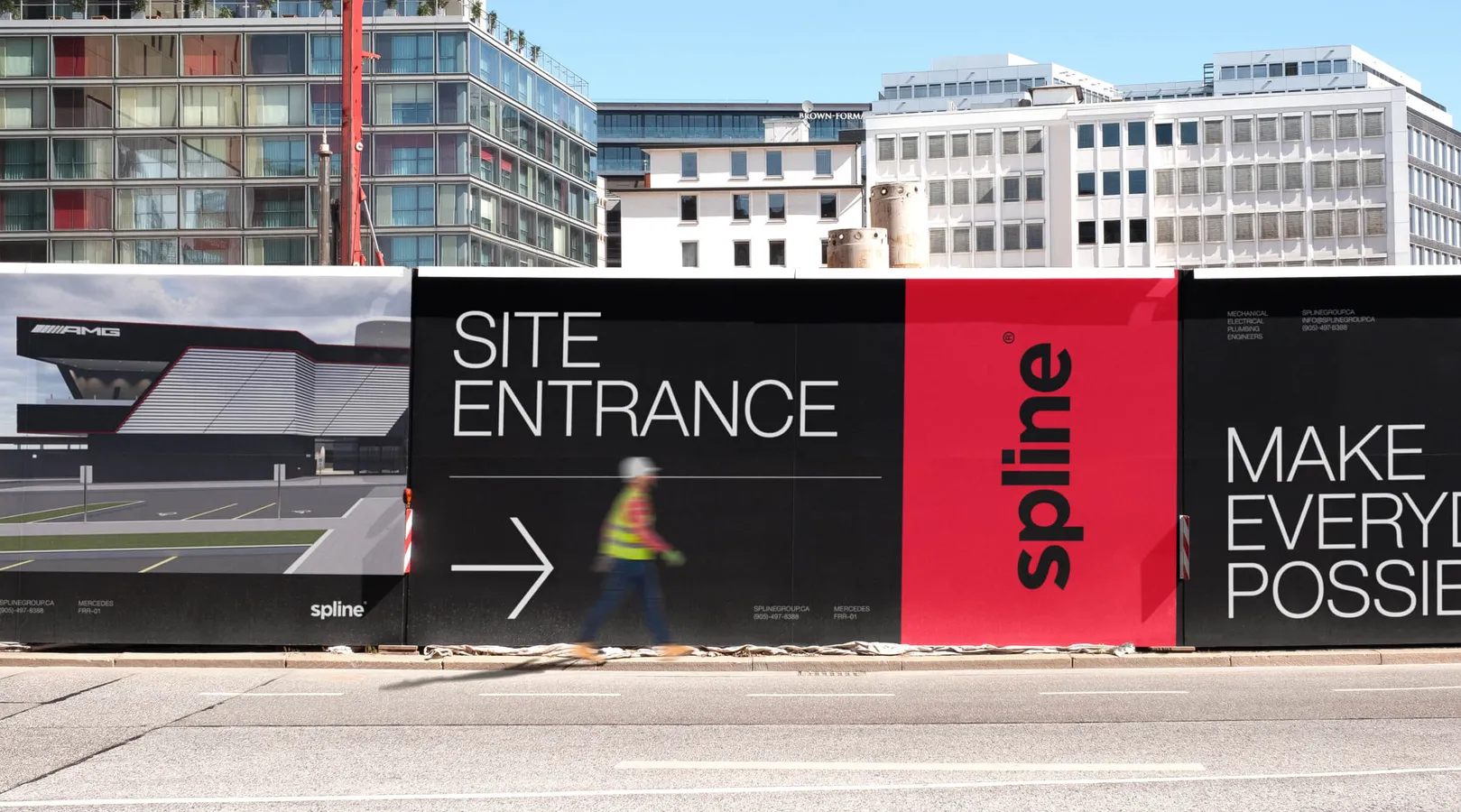
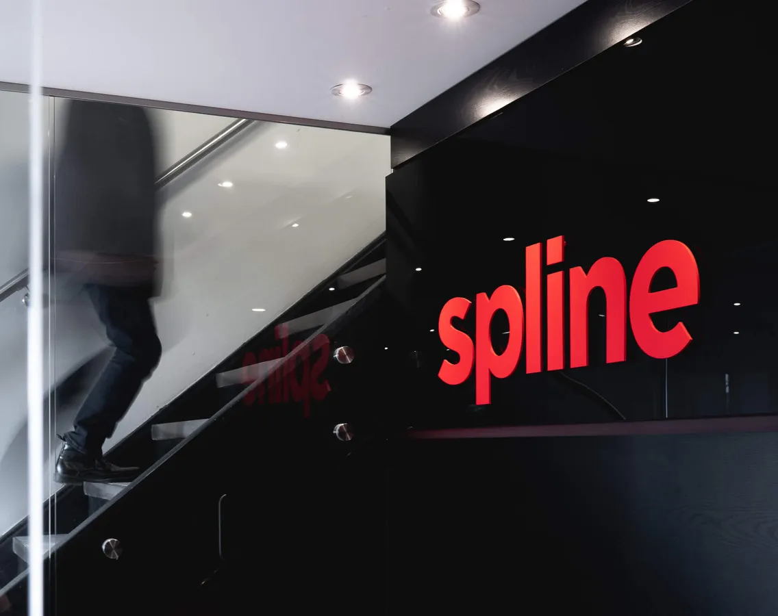
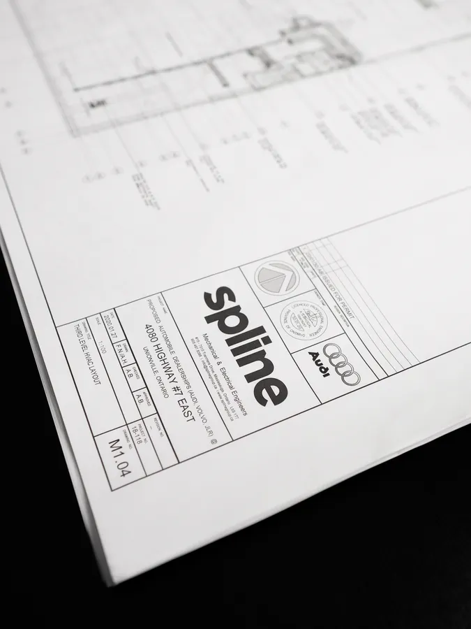
Spline Group’s growth had outpaced its identity and digital presence. I led the development of a new brand identity and website to reposition the firm as a design-forward engineering partner aligned with how architects think and work. Rather than leaning into typical technical cues, the system was elevated to feel confident, refined, and architectural, while remaining simple and practical for everyday use. The website was designed and built in Webflow to support clarity, consistency, and scale. The refreshed identity resonated immediately with existing partners, helped attract new business, and positioned Spline as a place top engineering talent wanted to join.
VOIR PLUS
SERVICES
STRATÉGIE DE MARQUE, IDENTITÉ, SITE WEB
COLLABORATEURS
SG_01.MP4
SG_02.JPG
SG_03.JPG
SG_04.JPG
SG_05.MP4
SG_06.JPG
Spline Group
,
STRATÉGIE DE MARQUE, IDENTITÉ, SITE WEB
,
2020
DÉTAILS DU PROJET
Spline Group’s growth had outpaced its identity and digital presence. I led the development of a new brand identity and website to reposition the firm as a design-forward engineering partner aligned with how architects think and work. Rather than leaning into typical technical cues, the system was elevated to feel confident, refined, and architectural, while remaining simple and practical for everyday use. The website was designed and built in Webflow to support clarity, consistency, and scale. The refreshed identity resonated immediately with existing partners, helped attract new business, and positioned Spline as a place top engineering talent wanted to join.
SG_01.MP4
SG_02.JPG
SG_03.JPG
SG_04.JPG
SG_05.MP4
SG_06.JPG